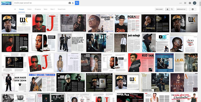
When conducting research into what the current existing magazines are for my chosen genre; Rap and Hip-Hop, I can initially see that most of the double page spreads are split into half with on side (usually the left side) having the center of visual interest, and the opposite right hand side being usually text dominated.I can implement this into my own magazine as I can split the double page spread evenly also only using one side for text, I can see that on this side of text the background color is usually white, this is effective as it allows the magazine to use the black font which then can be read very easily. The black font is on all of the double page spreads i can see, this means I must implement this onto my magazine, This way I will be obeying the current codes and conventions as well as making my magazine look to the standards of an existing magazine. The main image is usually a medium close shot, this means you can see the image clearly and also you can see a apart of the body, I would state that in my magazine I am going to make my image a medium shot, slightly different to the existing magazine double page spreads however I would like to see my actors clothing on my magazine, therefore i am going to make the image on the left side of the page and make the image a medium close shot. I am also going to make the double page spread the same font as the contents masthead, I am doing this to show continuity in my magazines other existing magazine have the same font running throughout the page of the specific magazine. I a also going to implement a large letter on one side of my double page spread however make it subtle, i ave seen this in some of "Q" magazines double page spread and i think this looks effective.
Planning -
When looking at my double page spread I believe that I will need to include a variety of different elements to create a professional and approachable double page spread that will both make the reader interested and achieve my core proposition which will be to make the reader informed about up to date news based on the genre rap/hip-hop.
I will firstly look at the lay outs of the magazine as this is vital to making my magazine look professional and makes it easy for my target audience to read and to gain information, The layout will consist of several conventions of features that will make my magazine apply to current codes and conventions, for example my double page spread must include a center of visual interest (CVI) as this is what draws the reader to the double page spread in the first pace. A large and striking picture I believe have more impact on the target reader as the image could be relate able or could make the reader interested in the unique life style that the image is presenting. When looking back at my research I can identify that magazine double page spreads from my specific genre almost always have a male as the CVI, I will include this in my own magazine to ensure my own magazine will look like an existing music magazine. From the layouts I have researched it is apparent that throughout all music magazines the double page spread is predominantly split into two sides with one side being predominantly text based and the other consisting of the large image. I will use this in my own magazine as it is clear throughout the research I have conducted this is a clear convention of the layout.
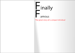
In this screen shot I have shown my initial plan of what my double page spread will look like, I have used my house style to gain the three colors however have only used two which are black and white. This is effective as it makes the magazine easy to read due to contrast and also applies to the research I have conducted which shows that most of the music magazines in my genre have used the colors white and black, However I do not like the fonts that i have used in this example, I think that the two I have chosen are too contrasting and make the magazine look unprofessional I believe that I will need to make the two fonts either the same or similar to maintain consistency and a running house style which I have already shown evidence of in a previous post to this blog. I think that the choice of splitting the magazine into two sides is wise as it allows me more space and also guidelines as to how big both the image and the body of text will need to be. Although I have not added the two, when visualizing examples of what I can input into the two large spaces I can have a long shot of my model on the left hand side with the right hand side being filled with text which is around font size 8, this will make it look like existing music magazine as the font size is always very small to allow them to input more into the magazine.
In this screen shot I have chosen too make the headline shorter, this is an attempt to make it less time consuming for my magazine as they may not have time to read the article due to my audience being in the ABC1 bracket of the general register scale and with them also being aspire-res, Also due to my audience being one of a younger variety I have chosen to use a literary device in the form of a simile as my double page spread headline, This is effective as it allows the reader to remember the name of the article quickly and perhaps subconsciously as it is a rapid title that is not uncommon for magazines in my genre to want to achieve such as "Fame". I have then decided to use all three colors in this plan as it makes the magazine look more realistic and makes it apply with the conventions of the rule. I have then used a crop cap at the start of my double page spread headline, this is unusual for a headline however and therefore I doubt that I will be using this feature. This plan does not attract me and therefore will not attract my target audience, I believe that there is too much negative space between the headline and it feels empty and incomplete.
While making this final screen shot I am able to identify that this is the most realistic layout that I can base my magazine upon. A large headline makes it clear for my target audience to read to and to gain a basic understanding of my article. I then have change the colour of one letter of the headline to a bright red colour, this is going with both my house style and my research as both show that the double page spreads use three colours which majority include Red, Black and White all of which I have included in this screenshot. I have once again decided to split the double page spread into two with one half being text dominated and the second being a large image of my actor that I have taken. I have decided to show you where I plan to input my text and how it would look like when the text has been implemented. The text will not be too dominating as it will not take the majority of the right hand side either. I have chosen to use a pull quote in the middle of my text page as this is a convention that I have seen throughout the research section of my magazine.
When originally taking this image into consideration I believe that the image looks professional and would be easy to manipulate using Photoshop, The image sows the affluent clothing that my actor possesses, This is to attract my target audience as it shows that I am targeting younger people due to the style of clothes, Items such as the large bomber jacket, the baseball hat and the baseball jersey all show that my target audience is one of a younger generation. The mis-en-scene that my model is using looks like a typical rap/hip-hop magazine. The pose shows that the actor may not have rules as the squat position shows that the model may also lack respect.
In this image I am able to see that it is much more effective for a double page spread s it shows allot more of the body due to the body positioning of my model. the longer shot shows the clothing of my model much more effectively and also allows the audience to see the image and could potentially turn to a prosumer. The body language shows that the model is masculine as the models shoulders are lowered and therefore are not scared of insecurities. However the photo is quite dark as the lights may not have been directly on the subject himself.


No comments:
Post a Comment