Q magazine

Language Use
| |
Punctuation
|
The use of punctuation in the initial quote shows that the person who said it may be serious or ironic, however the exclamation point could show that the tone of the interview is a serious conversation and that he is trying to get his point across.
|
Use of quotes
|
The use of quotes enable NME to show some of what the actor is saying, the use of quotes show the personal relationship that the interviewer could have with the main actor in the article. “I’m binging ginger back!” The use of this quote sows that he is unique as he has ginger hair, it also shows the he is a current artist as he is referring in present tense.
|
Irony
|
The quote could be seen as irony as it could be referring to the Justin Timberlake song, “im bringing sexy back” this provides the audience with comedy and also makes the double page spread seem more of a discussion than an interview as it is seen as more friendly.
|
Persuasive tone
|
Throughout the double page spread I can see The producer of the interview is using a consistent persuasive tone to get his point across about Ed Sheeran.
|
Features
|
Purpose
|
Denotations
|
Connotations
|
Links to target audience
|
Column Gutter
|
The purpose of the column gutter will be too separate the articles, This makes the magazine spread look very professional and also make it easier for the consumer to read.
|
“The space between types of columns”
|
Between columns that there is enough negative space in between each one. This will then spread the paragraphs and makes the page look wider and more text heavy while still having negative space.
|
The type o audience that will read this magazine are between the ages of 17-30, this could mean that they do not have allot of time to read a whole magazine and therefore will need this space to save time.
|
Subhead
|
The purpose is to inform the consumers hat the spread is about, therefore it will give the audience some idea of what it is they are going to be reading.
|
“I’m bringing ginger back!”
|
The use of the subheading is used in the bottom left of the double page spread, it is white and red which shows the colour scheme of the whole magazine.
|
The audience may like a large subheading in the bottom corner as it informs the audience what the spread is going to involve.
|
Negative Space
|
There is negative space to counter the positive space which is the text, the negative space
|
Is the space where there is no text or image just white space
|
On this double page spread there is not allot negative space as it is mostly filled with the background image.
|
The audience may like a more text heavy double page spread and prefer information over creativity, however will still have a large dominating image.
|
NME -

Language Use
| |
Quote
|
The subheading is a large quote that takes up the majority of the page, it is large and also makes the article more personal. “People think in an attention seeker, but im just honest” could show that the actor is rebellious.
|
Formal language
|
When reading the double page spread I can see that there is no informal language that could make the magazine double page spread look unprofessional and colloquial, NME will have a reputation to maintain and therefore will need to keep the magazine up to the NME standard.
|
Emotive language
|
When reading the double page spread I can see that some emotive language was used, words such as “It’s not me it’s you” this is very dramatic and make the double page spread look like a very serious article.
|
Embedded Quotes
|
The quotes that are embedded makes the article more personal as it comes from their own mouth, this builds trust between the target reader and the producer of the magazine.
|
Features
|
Purpose
|
Denotations
|
Connotations
|
Links to target audience
|
CVI
|
To attract the reader and get them on personal terms, its first priority is to attract the reader’s attention with a striking pose that matches their music genre.
|
The prominent item that takes up the majority of the page.
|
The image shows Lilly Allen sideways to the camera, the shot is a medium shot as the shoulders of the actor are clearly visible.
|
With Lilly Allen being a large star she may attract allot of attention. The image must make the reader interested and if they are fans they will need to make the actor recognisable.
|
Headline
|
The headline of this article is to promote the content of the double page spread, and also let the audience know what the double page spread will be about.
|
The main headline should be either in the present or future tense also it will have to be quite large to draw attention.
|
The headline is found at the top of the page, it is large and will take up the majority of the double page spread.
|
The large headline will attract the audience as it is large and has striking colours, The font is unique and tis will draw attention t the main headline which shows what is in the double page spread.
|
WOB
|
White on black creates a nice contrast which is very professional and makes the image stand out more as everything is white and black except the main image.
|
White on black is when the colours white and black are used to create a contrast in colour.
|
The white on black creates a very striking image as It is distinctive and also will stand out more for the audience.
|
The audience will be attracted by the WOB text, the effect will also be complimentary with the font as it will be unique and target the audience of NME which is edgy.
|
Negative space
|
Negative space is needed to create space In between the text and the white background, this creates space and allows spacing in between the two. This allows the difference too make it look professional.
|
Is the space where there is no text or image just white space
|
On this double page spread there is not allot negative space as it is mostly filled with the background image.
|
The audience may like a more text heavy double page spread and prefer information over creativity, however will still have a large dominating image.
|
Vibe –

Language Use
| |
Punctuation
|
The punctuation used in this interview in good effect, The use of full stops mean that sentences are shorter which creates dramatic effect. It also saves space as the paragraphs will be shorter in length, this will make it more appealing for the consumers to read as it will take less tie to finish.
|
Rhetorical Question
|
There is a rhetorical question in the main headline as the question “How high” this is a rhetorical question and it makes the reader think, however it is not a large rhetorical question and could be missed out.
|
Emotive language
|
There is emotive language used and is effective in making the magazine contents more serious, Text such as “I dreamed about success in the music industry” this shows that the interview is very formal and also could be inspiring.
|
Embedded Quotes
|
There is an embedded quote that states “I dreamed about success in the music industry” this is an embedded quote that makes the interview feel more personal.
|
Features
|
Purpose
|
Denotations
|
Connotations
|
Links to target audience
|
CVI
|
The CVI is there to make the readers interested, the image is very striking.
|
The prominent item that takes up the majority of the page.
|
The image shows that Wiz Khalifa is smoking, this could show a rebellious mind state that most artists of this genre represent.
|
The audience may like the same things as what the artist is representing.
|
Headline
|
The headline will show a logo, the logo will be black and yellow.
|
The main headline should be either in the present or future tense also it will have to be quite large to draw attention.
|
The headline is found at the top right of the page, it is large and will take up the majority of the double page spread. The logo is effective as it is unique and a long headline is not necessary.
|
The logo/headline is unique as It is black and yellow and a l0go. This is not common for a music magazine to have however it suits the simplicity of this double page spread.
|
Filler
|
There is a filler, a filler reduces the amount of negative space that the double page spread would contain.
|
An item that reduces the amount of negative space there is on the double page spread.
|
On this double page spread there is a singular filler that is used in the bottom right of the spread. Which is the words “A small fortune” in a different colour text.
|
This will target the audience as they may not have time to read a long article however it spaces out the page well and makes the article more manageable for the young Vibe targeted audience
|
Negative space
|
Negative space is needed to create space In between the text and the white background, this creates space and allows spacing in between the two. This allows the difference to make it look professional.
|
Is the space where there is no text or image just white space
|
On this double page spread there is a fair amount of negative space, the space will allow the magazine double page spread to look professional and not too busy which is seemingly what the page is trying to accomplish
|
The audience may like a more text heavy double page spread and prefer information over creativity, however will still have a large dominating image.
|
Q MAGAZINE


EXAMPLE OF ARTISTS/BANDS


NME MAGAZINE


EXAMPLE OF ARTISTS/BANDS


VIBE MAGAZINE
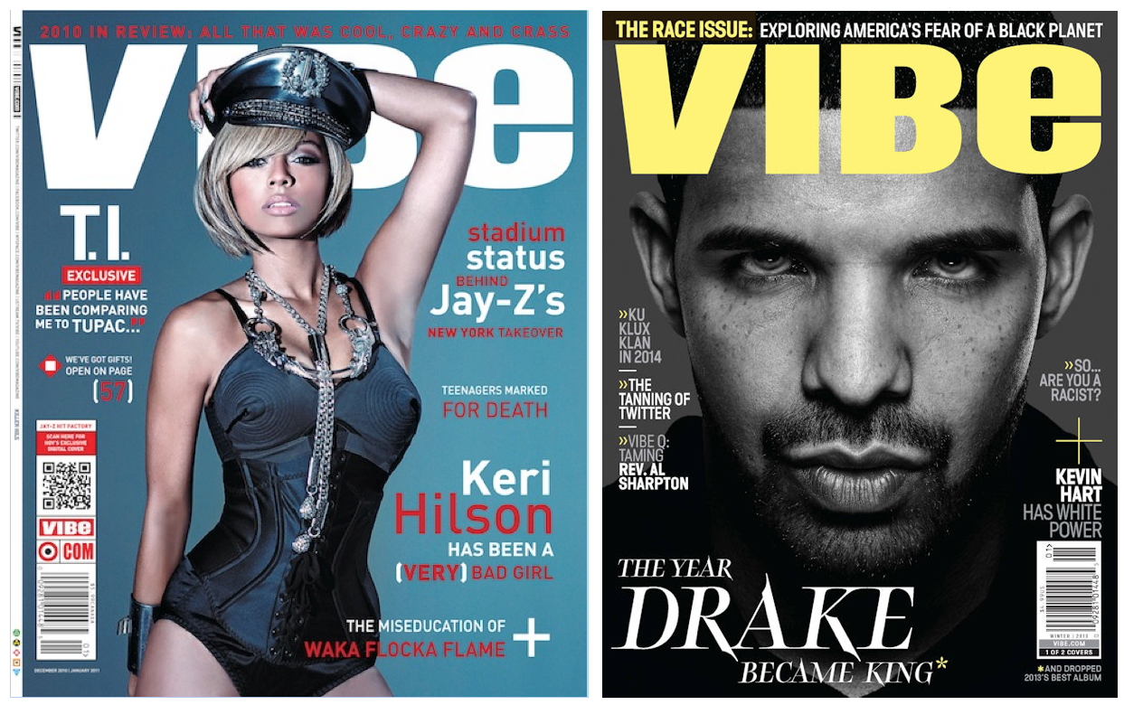


EXAMPLE OF ARTISTS


CLASH MAGAZINE


EXAMPLES OF ARTISTS

No comments:
Post a Comment