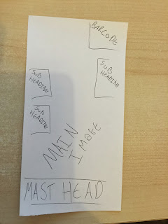
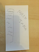
My magazine would represent a specific audience who in this case would be young teenagers as it is a school magazine. A young boy would be presented on the front cover and then another two would be presented in the contents page, this would show that my audience would be teenagers as it would represent the younger generation. My main text would attract my target audience as it is clearly legible for all of the school to see and read my magazine cover, this would allow/enable more people of any specific reading age to be able to read and understand the cover of my magazine. An area of improvement when representing a social group would be i could have added more color into my magazine this would be an improvement as more people would be attracted to my magazine this way with the bright eye catching colors being on display, i have only used very basic colors on my magazine but in order to represent more of my target audience i would need to add more colors into my work.
My magazine cover looks very professional and was designed using adobe in-design, this pro gramme would allow me to create a effective concept/prototype for my preliminary task. I have also used the pro gramme Photoshop to make adjustments to my front cover in terms f exposure and underexposure, i have chosen to use a gradient on my models face to create a contrast and to make it look more professional and to show that i am able to use other pro gramme's to edit and manipulate my photographs, I have made no other manipulations to this image however in my main task i will want to use Photoshop more to manipulate images and make my magazine unique and stand out.
The photography used on my magazine was taken by me, the first picture is a medium close shot of a peer/class mate we have used a professional background by being resourceful and using a backdrop and lighting to make the photo a better quality and easy to manipulate if chosen to do so. i have chosen a medium close up as it shows the face of my model clearly and also would be in the specification of the preliminary task. On my contents page I have used a medium close up 2, allowing two people in the shot to give a contrast in skin complexion and to alternate from my front page of the magazine. I have used a professional camera to gain the best results as it would look more professional and would.
Using these particular technology I have been able to expand my knowledge upon the manipulating of photo's using either Photoshop or adobe in design ,using these two programmes I will be to manipulate photos with very little knowledge upon the two applications.
EVALUATION -
http://prezi.com/dzlnmg89erlj/?utm_campaign=http://prezi.com/dzlnmg89erlj/?utm_campaign=share&utm_medium=copyshare&u
.jpg)


